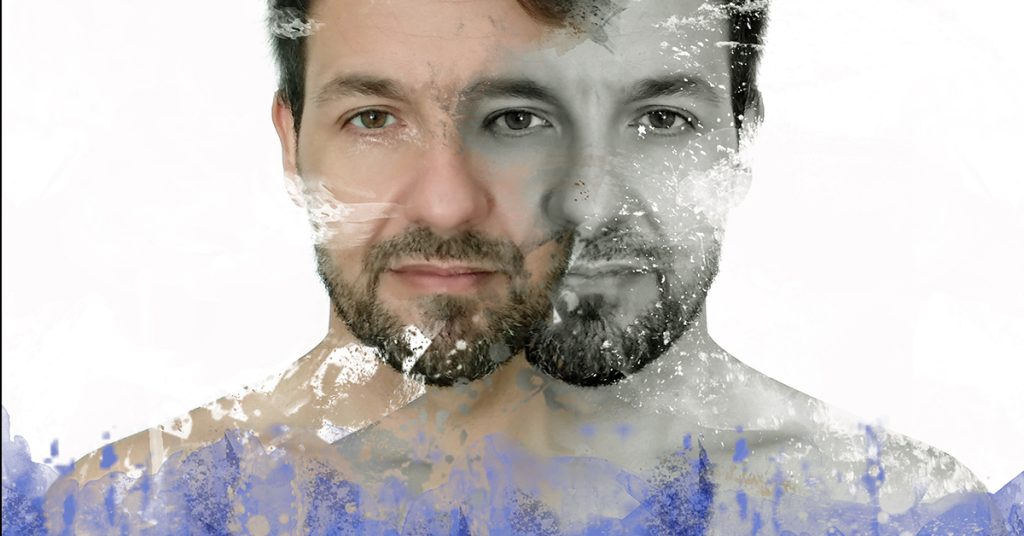
- Introduction
- The Basics of Color Psychology Theory
- Cultural and Symbolic Associations
- Emotional Impact of Colors
- Color Combinations and Their Meanings
- The Role of Color in Different Art Forms
- The Cultural Significance of Colors
- Applying Color Psychology in Art Creation
- Conclusion
- Frequently Asked Questions (FAQs)
Introduction
Colors have a profound impact on our emotions, perceptions, and behaviors. Artists and designers have long recognized the significance of color psychology in their creative endeavors. By understanding the basics of color theory, cultural and symbolic associations, and the psychological effects of different colors, they can harness the power of colors to create compelling and impactful artworks. In this article, we will delve into the fascinating world of color psychology and its application in art and design.
The Basics of Color Psychology Theory
Color theory, intertwined with the fascinating field of color psychology, provides valuable insights into how colors influence human perception, emotions, and behavior. It serves as a powerful tool for artists and designers to create impactful visual experiences.
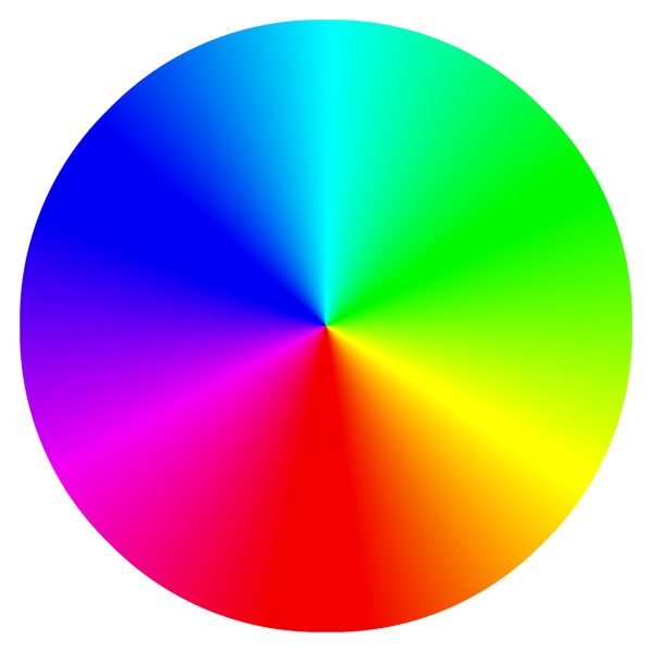
Color Wheel
One of the key elements of color theory is the color wheel, which serves as a visual representation of the relationships between colors. By examining the color wheel, we can identify primary colors (red, blue, and yellow), secondary colors (orange, green, and purple), and tertiary colors (combinations of primary and secondary colors). This knowledge forms the building blocks for understanding color combinations and their effects on the viewer.
Color Harmony
Color harmony, another essential concept within color theory, explores the pleasing arrangement of colors in a composition. By employing harmonious color schemes, artists and designers can create visual balance and coherence. Different harmonies, such as complementary, analogous, and triadic colors, offer distinct emotional impacts and visual aesthetics. Complementary colors, positioned opposite each other on the color wheel, create a striking contrast and dynamic energy. Analogous colors, found next to each other on the color wheel, evoke a sense of harmony and unity. Triadic color schemes, consisting of colors equally spaced on the color wheel, produce a vibrant and balanced composition.
Color Temperature
Color temperature is a vital aspect of color theory that influences the emotional response to colors. Warm colors, such as red and orange, are associated with energy, passion, and excitement. They can evoke feelings of warmth and intensity. In contrast, cool colors like blue and green are known for their calming and soothing effects. They create a sense of tranquility and serenity. Understanding color temperature allows artists and designers to manipulate the mood and atmosphere of their artwork, effectively conveying specific emotions and messages.
By delving into the realm of color psychology and grasping the principles of color theory, artists and designers can harness the immense power of colors to elicit emotional responses and enhance their artistic expressions. Whether seeking to convey passion, tranquility, excitement, or harmony, the mastery of color theory enables artists to create captivating and thought-provoking visuals that resonate with viewers on a profound level.
Cultural and Symbolic Associations
In the realm of color psychology, colors carry cultural and symbolic associations that vary across different societies and historical periods. These associations play a significant role in shaping our perceptions and interpretations of colors. Exploring the cultural and symbolic significance of colors adds depth and richness to artistic expression, allowing artists and designers to tap into the collective understanding and meaning attached to certain colors.
For example, red is often associated with passion, energy, and power in many cultures. Its vibrant and intense nature makes it a powerful tool for conveying strong emotions and creating a sense of excitement in art and design. On the other hand, blue is commonly linked to calmness, serenity, and trust. Its cool and soothing qualities evoke a sense of tranquility and stability, making it ideal for creating peaceful and harmonious atmospheres.
Understanding the cultural and symbolic associations of colors enables artists and designers to leverage these meanings in their creative endeavors. By intentionally using colors that carry specific cultural or symbolic significance, they can evoke desired emotions, establish connections with viewers, and effectively communicate their intended messages. It adds a layer of depth and resonance to the artistic process, allowing colors to transcend their visual appeal and become powerful conveyors of meaning and cultural communication.
Emotional Impact of Colors
Colors have the ability to evoke specific emotions and influence our mood. Understanding the emotional impact of colors allows artists and designers to create artworks that resonate with viewers on an emotional level. Let’s explore the psychological effects of some common colors:

Red Color Psychology: Passion, Energy, and Power
Red is a vibrant and intense color associated with strong emotions. It evokes feelings of passion, energy, and power. Artists often use red to create artworks that command attention and elicit a sense of excitement and intensity.

Purple Color Psychology: Luxury, Mystery, and Spirituality
Purple is a color often associated with luxury, mystery, and spirituality. It has a sense of elegance and depth. Artists use purple to create artworks that exude a sense of opulence, mystique, and spiritual exploration.

Blue Color Psychology: Calmness, Serenity, and Trust
Blue is a cool and soothing color that brings about a sense of calmness, serenity, and trust. It is often used to create tranquil and peaceful environments in artworks. Blue can evoke a sense of stability and reliability.

Green Color Psychology: Harmony, Growth, and Renewal
Green is associated with nature, representing harmony, growth, and renewal. It has a calming effect and is often used to create artworks that convey a sense of balance and tranquility. Green can also symbolize fertility and rejuvenation.

Yellow Color Psychology: Happiness, Optimism, and Creativity
Yellow is a bright and cheerful color that conveys feelings of happiness, optimism, and creativity. Artists use yellow to evoke joy and positivity in their artworks. It is a color that symbolizes energy and stimulates creativity.

Orange Color Psychology: Enthusiasm, Warmth, and Vitality
Orange is a vibrant and energetic color that radiates enthusiasm, warmth, and vitality. It grabs attention and creates a sense of excitement. Artists use orange to inject energy and liveliness into their artworks.
Color Combinations and Their Meanings
The combination of colors in an artwork can significantly impact its overall message and visual impact. Different color combinations evoke different emotions and create unique aesthetic experiences. Let’s explore some popular color combinations and their meanings:
Complementary Colors: Balance and Contrast
Complementary colors are opposite each other on the color wheel, such as red and green or blue and orange. These combinations create a sense of balance and contrast, capturing attention and enhancing visual impact.
Analogous Colors: Harmony and Coherence
Analogous colors are adjacent to each other on the color wheel, such as blue, blue-green, and green. These combinations create a sense of harmony and coherence, often used to convey a tranquil and unified atmosphere.
Triadic Colors: Vibrancy and Dynamism
Triadic colors are evenly spaced around the color wheel, such as red, yellow, and blue. These combinations bring vibrancy and dynamism to artworks, creating a visually striking and energetic composition.
The Role of Color in Different Art Forms
Color plays a crucial role in various art forms, allowing artists to convey specific moods, enhance narratives, shape perception, and communicate messages. Let’s explore how color is utilized in different art forms:
Painting: Conveying Mood and Atmosphere
In painting, colors are used to evoke specific moods and create atmospheric effects. Artists carefully select colors to set the tone of their artworks, whether it’s a serene landscape, a dramatic portrait, or an abstract expression of emotions.
Photography: Enhancing Narrative and Impact
In photography, colors contribute to storytelling and visual impact. Photographers use color to enhance the narrative, highlight emotions, and capture the essence of a moment. From vibrant street photography to moody black and white portraits, color choices greatly influence the overall perception of the image.
Sculpture: Shaping Perception and Texture
Colors in sculpture play a significant role in shaping perception and emphasizing texture. Artists use colors to accentuate the details, create depth, and evoke tactile sensations. Whether it’s a bronze sculpture with a rich patina or a vibrant installation, colors enhance the sculptural experience.
Graphic Design: Communicating Messages and Branding
In graphic design, colors are powerful tools for communicating messages and establishing brand identities. Designers strategically select colors to evoke specific emotions, create visual hierarchy, and differentiate brands. From bold and vibrant palettes to minimalistic and monochromatic schemes, color choices shape the visual identity of a design.
The Cultural Significance of Colors
Colors hold cultural significance and can vary in meaning across different cultures and contexts. Let’s explore the cultural symbolism of some colors:
Red in Eastern and Western Cultures
In Eastern cultures, red is associated with luck, celebration, and prosperity. It is often used in festive occasions and symbolic rituals. In Western cultures, red can represent love, passion, and danger. Understanding the cultural context helps artists and designers effectively communicate their intended messages.
Blue in Religious and Artistic Contexts
Blue holds diverse meanings in religious and artistic contexts. In Christianity, blue is associated with spirituality and divine grace. In art, blue often symbolizes depth, tranquility, and the infinite expanse of the sky and sea. Artists leverage these associations to convey specific meanings and evoke emotions.
Gold in Royalty and Sacred Symbolism
Gold has long been associated with wealth, royalty, and divine attributes. It signifies opulence, power, and sacredness. Artists throughout history have used gold to depict the divine, highlight significant elements, and emphasize the importance of the subject matter.
White in Purity and Innocence
White is commonly associated with purity, innocence, and cleanliness. It symbolizes new beginnings and is often used in weddings, religious ceremonies, and artworks that convey a sense of purity and simplicity.
Applying Color Psychology in Art Creation
Now that we have explored the foundations of color psychology and its various applications, let’s discuss how artists can effectively apply color psychology in their art creation process. Here are some key considerations:
Choosing Colors for Emotional Impact
Artists should carefully select colors based on the emotional impact they want to convey. By understanding the psychological effects of colors, artists can evoke specific emotions in viewers and create a more immersive artistic experience.
Creating Depth and Contrast
Color choices can influence the perception of depth and create visual contrast within artworks. Artists can use warm and cool tones to create a sense of spatial depth and employ contrasting colors to highlight specific elements or create visual tension.
Balancing Warm and Cool Tones
Balancing warm and cool tones within an artwork can contribute to its overall visual harmony. Artists can create a balanced composition by strategically placing warm and cool colors, ensuring that one does not overpower the other.
Experimenting with Color Combinations
Artists should explore various color combinations to create unique and impactful artworks. By experimenting with different color palettes and harmonies, artists can push the boundaries of their creative expression and evoke diverse emotional responses from viewers.
Conclusion
Color psychology is a powerful tool that artists and designers can harness to create captivating and emotionally engaging artworks. By understanding the basics of color theory, cultural associations, and the psychological effects of colors, artists can skillfully manipulate colors to convey specific messages, elicit emotions, and create meaningful connections with their audience. Whether it’s a painting, photograph, sculpture, or graphic design, colors play a vital role in shaping the artistic experience and leaving a lasting impact on viewers. So, let your artistic journey be enriched by the world of color psychology, as you explore the endless possibilities that colors bring to your creations.
Frequently Asked Questions (FAQs)
Q: What is color psychology?
A: Color psychology is the study of how colors affect human behavior, emotions, and perception. It explores the psychological and emotional responses that different colors evoke in individuals, as well as the cultural and symbolic associations attached to specific colors.
Q: How does color impact our emotions?
A: Colors have the power to evoke specific emotions and moods. For example, warm colors like red and orange can elicit feelings of passion and energy, while cool colors like blue and green can create a sense of calmness and tranquility. The psychological impact of colors is subjective and can vary from person to person.
Q: Can color choices influence consumer behavior in marketing?
A: Yes, color plays a significant role in marketing and branding. Different colors can influence consumer perceptions, evoke specific emotions, and even impact purchasing decisions. For example, certain colors are often associated with specific qualities or traits, and companies strategically use these colors to align their brand identity with desired consumer perceptions.
Q: How can artists apply color psychology in their artwork?
A: Artists can apply color psychology in their artwork by carefully selecting colors to evoke specific emotions and convey intended messages. By understanding the meanings and associations of different colors, artists can create artwork that resonates with viewers on a deeper emotional level.
Q: Do cultural differences impact the symbolism of colors?
A: Yes, cultural differences play a significant role in the symbolism and meaning attributed to colors. Colors can have different cultural associations and interpretations across various societies and regions. It is essential for artists and designers to consider the cultural context when using colors in their artwork to ensure effective communication and avoid potential misunderstandings.
Related Posts